Tips for Interior Design: Color Psychology and Picture Frame Choice

Color is one of the most powerful tools for shaping how a space feels. It can make the interior design of a room feel calm or energizing, expansive or intimate. While wall color, textiles, and lighting often take center stage, picture frames quietly contribute to the emotional tone of a room as well. The color and finish of a frame can influence not just how art looks, but how the entire space feels.
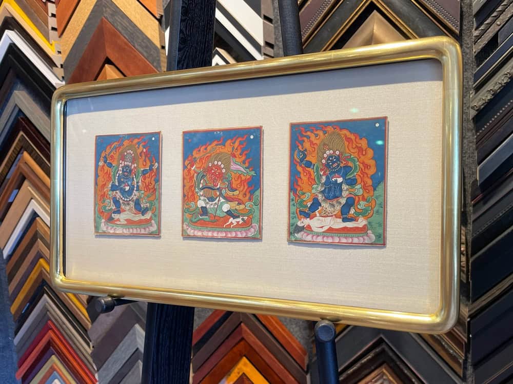
At Capricorn Framing, we often help clients discover that choosing a custom picture frame isn’t just about matching an artwork — it’s about complementing the atmosphere they want to create.
Using Frames as Interior Design Connectors
One of the most rewarding aspects of custom picture framing is how it helps connect disparate elements within a space. Frames can tie together tones from different parts of the room — such as a brass lamp, a walnut side table, or a black metal chair — creating visual harmony.
Interior designers often use this approach to achieve subtle cohesion. For instance, if a living room has gold accents and cream upholstery, using a gold or champagne-toned frame can reinforce the palette without overpowering it. Similarly, a series of white frames in varying sizes can unify a gallery wall even when the artwork inside is eclectic.
Color Psychology: The Emotional Impact of a Picture Frame
Frame color plays a subtle but important role in the psychology of space. Just as paint colors evoke emotion, picture frame tones can reinforce or contrast with a room’s energy. Understanding the emotional associations of color helps interior designers and homeowners make intentional choices.
Warm tones — such as gold, bronze, cherry, or walnut — bring warmth and richness. They can make a space feel inviting, grounded, and timeless. These frames work beautifully in traditional interiors or in rooms that could benefit from a touch of coziness, such as living rooms or bedrooms.
Cool tones, like black, gray, silver, and natural maple, tend to feel sleek and modern. They create contrast and structure, often enhancing the clarity and focus of contemporary artwork or photography. Cool-toned frames are excellent for minimalist or urban spaces where simplicity and balance are key.
Neutral tones, including whites, creams, and natural woods, are incredibly versatile. They let the artwork and surrounding decor speak for themselves, creating a calm and cohesive environment. Neutrals are ideal for Scandinavian-inspired interiors, airy coastal homes, or any setting that emphasizes light and openness.
Selecting Frame Colors to Set the Mood
When selecting a frame, think beyond the artwork for interior design — consider how the piece interacts with the rest of the room. Framing choices can amplify or soften the mood that interior designers work hard to establish.
- Serene and Relaxing Spaces:
In bedrooms, spas, or reading nooks, choose frames that echo calmness — such as pale wood, whitewashed oak, or brushed silver. These tones work harmoniously with soft blues, greens, or neutrals, helping to maintain a tranquil flow. - Energizing and Creative Environments:
For studios, offices, or vibrant living spaces, experiment with contrast. Bold black or deep espresso frames can ground colorful artwork, while metallics like gold or copper introduce dynamic warmth. A pop of color — think navy, moss green, or even coral — can act as a playful design accent. - Elegant and Timeless Interiors:
Gold-leaf frames, mahogany finishes, and other classic tones convey luxury and history. They complement rich fabrics, patterned wallpaper, and antique furnishings beautifully. However, pairing them with minimalist art can create a striking, contemporary juxtaposition. - Modern and Minimalist Rooms:
Sleek black, white, or metal frames align with the clean lines of modern interiors. Floating frames or thin profiles add sophistication without visual clutter, allowing the art — and the architecture — to take center stage.
Balancing Art, Frame, and Wall Color
Frame color isn’t chosen in isolation. It’s part of a trio: artwork, frame, and wall. The relationship between these three elements determines whether a custom framed piece blends seamlessly into its environment or stands out as a focal point.
For example, a dark frame on a light wall immediately draws attention, creating contrast and drama. This can be effective for bold, modern art or when you want to highlight a specific piece in a gallery wall. Conversely, a frame that echoes the wall color can create a seamless, understated presentation that feels integrated into the room’s palette.
When working with colorful artwork, a neutral or natural wood frame often allows the piece to breathe. For monochromatic art or photography, a colored frame can introduce emotion — a warm tone adds intimacy, while a cool tone adds sophistication.
An Interior Design Collaboration
At Capricorn Framing, collaboration with interior designers is an integral part of the creative process. Our custom framers work closely with designers to ensure that every frame supports the intended aesthetic and emotional tone of a space. Whether a project calls for museum-level preservation framing or a sleek, modern presentation, our team helps translate design concepts into beautifully crafted, lasting results.
Designers often bring in fabric samples, paint swatches, and photographs of the space so that our picture framing experts can recommend materials, colors, and finishes that harmonize perfectly. This hands-on collaboration ensures that the final presentation feels cohesive — not only with the artwork but with the overall interior design vision. We can help from consultation to installation — just give us a call or visit our custom picture framing store in San Francisco.